
A sonic branding agency has one of the most counterintuitive problems in professional services: you sell something you can't show in a screenshot.
Your client's logo rebrand? Easy — put it in a full-width hero and let the contrast do the talking. Your sonic identity work? A waveform image and a SoundCloud embed don't cut it. They never have.
The problem isn't your work. The problem is that most agency websites weren't designed with audio in mind. They're visual templates retrofitted to hold sound — and clients feel the mismatch, even if they can't name it.
This article breaks down what a sonic branding agency website actually needs to convert serious clients: the structure, the components, and the decisions that turn visitors into briefs.
The Core Challenge: Selling Sound on a Visual Medium
When a prospect lands on your website, they're making a decision in under 10 seconds. They're pattern-matching: does this place look like it does serious work?
For most agencies, the answer is communicated visually — typography, layout, case study photography. For a sonic branding agency, you need one more layer: the site itself has to demonstrate that you understand sound.
Not just that you offer it as a service. That you think in audio. That the way you present your work — the player controls, the before/after structure, the vocabulary you use — signals expertise before a single word of copy is read.
That's the standard. Now here's how to meet it.
The 6 Elements a Sonic Branding Agency Website Needs
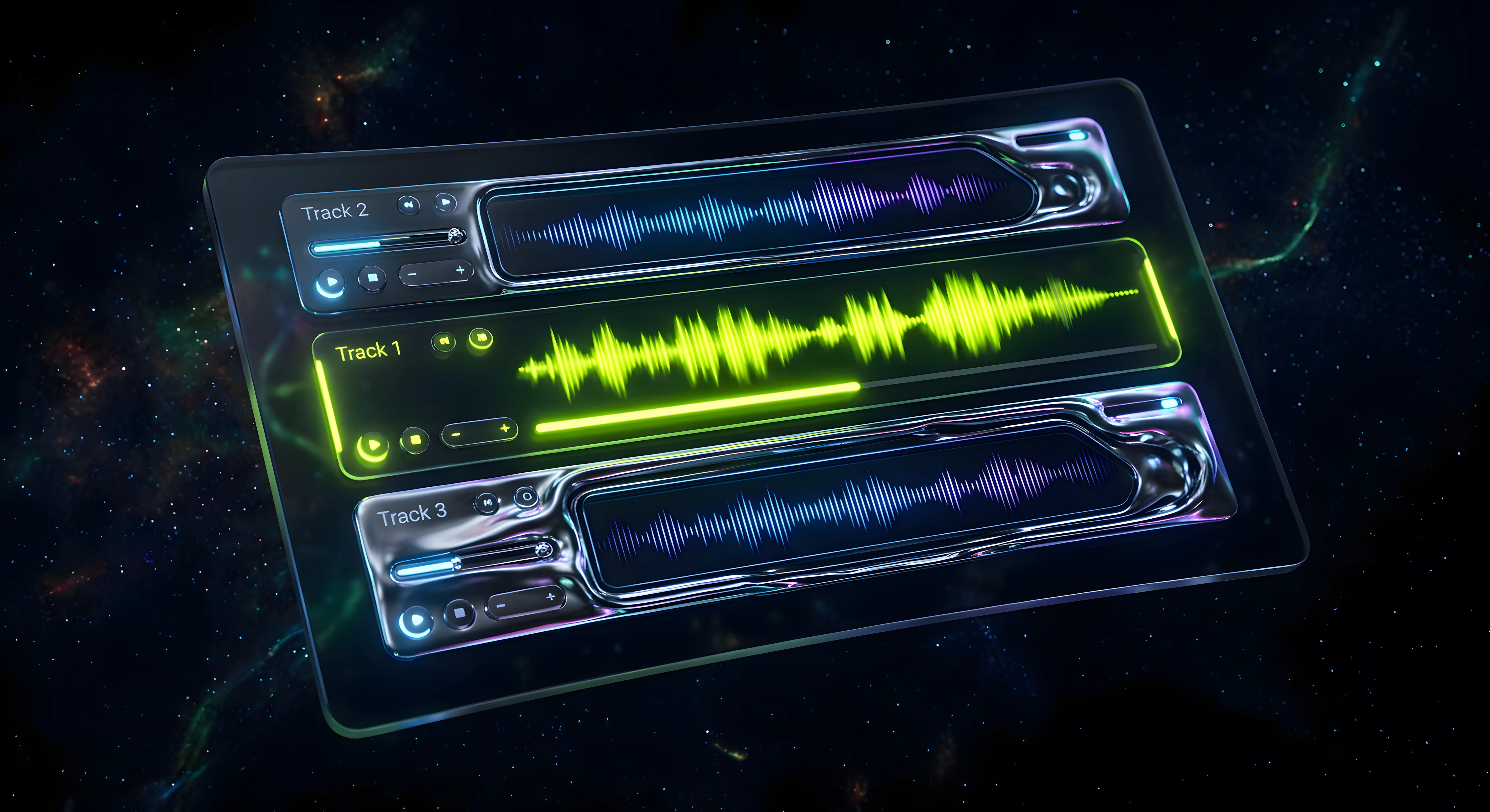
1. An Audio Showcase That Isn't an Afterthought
The most common mistake: a generic embedded SoundCloud or Spotify widget dropped into the footer of a case study.
That tells clients your audio is supplementary. It positions your work as an add-on to a visual identity, not a strategic asset.
A proper audio showcase does three things:
Plays inline, without leaving the page. No redirects. No new tabs. The prospect stays in your world.
Labels each asset clearly. Not just "Logo sound" — "Brand notification sound for fintech app, designed for 150ms delivery on iOS." Context = perceived expertise.
Groups by context. Separate your sonic logos from your UI sound systems from your brand themes. This signals that you understand the difference — which many agencies don't.
If your site is built in Framer, a custom audio player component with CMS-driven content solves this entirely. The alternative — static HTML audio tags — works, but it's not the signal you want to send.
2. Before/After Case Studies (Not Just Deliverables)
Case studies on most agency sites are deliverable dumps: a PDF, a Spotify link, a brand book excerpt. The implicit message is look what we made.
Clients in the brief stage aren't wondering what you made. They're wondering what problem it solved.
A sonic branding case study that converts shows:
The brief. What was the client trying to achieve? What did they sound like before?
The strategic problem. Was the brand too loud? Too generic? Associated with the wrong emotion?
The sonic direction. What palette, tempo range, instrumentation — and why those choices map to the brand.
The output. Now the deliverables. With full inline playback.
The result. Did the sonic identity roll out across video, app, events? What was the reception?
This structure transforms a deliverable into a proof of process. And process is what sophisticated clients are buying — not just a sound file.
3. A Dedicated Sonic Identity Section
Your own brand should be the first case study on your site.
If you're a sonic branding agency and your site doesn't have a section explaining your own sonic identity — how you arrived at it, what it's made of, where it lives — you're leaving a gaping credibility gap.
This section doesn't need to be long. It needs to be present. A few hundred words, a visual breakdown of your sound palette, and a playable demo is enough. It demonstrates that you've applied your own methodology to yourself.
For clients who've never commissioned sonic branding before, this section also functions as an education tool — which reduces the friction in the sales conversation significantly.
4. Social Proof Calibrated to Seriousness
Social proof on agency sites usually takes two forms: logos and testimonials. Both are fine. But for sonic branding specifically, the type of brands you've worked with matters more than the number.
A single notable brand — a regional bank, a CPG launch, a fintech app — is worth more than a grid of 20 unknown logos. Because the client asking the question is trying to answer: has someone like me trusted this agency?
If you don't have recognizable brand names yet, use industry context instead: "sonic identity systems for 4 fintech brands" or "3 product sound suites for consumer hardware." Specificity signals experience even when names are under NDA.
For more context on how successful sonic branding examples build credibility in the market, there's a deeper breakdown on the blog. For a UX-focused deep dive into one of the most studied sonic identities, see Netflix sonic branding UX — how the world's most-watched audio mark shapes user perception across product, marketing, and platform.
5. A Clear Service Menu with Honest Pricing Signals
Most sonic branding agencies bury their services in vague copy and a contact form. "Let's talk" is not a call to action for a client with a budget and a timeline.
Your service menu should answer three questions before a prospect sends a message:
What do you actually do? Sonic logo? Brand theme? UI sound system? Notification set? Be specific.
How long does it take? Even rough ranges (4–8 weeks, 3-month engagement) help clients self-qualify.
What does it cost? If you can't publish pricing, publish ranges or starting points. Hiding this information entirely costs you the confident, prepared clients — and attracts the ones who will haggle.
On sonic branding pricing, the range is wide — but context collapses it fast. A services page that acknowledges this honestly is more effective than one that pretends a single engagement is the answer for every client.
6. A CTA Designed for the Right Client — Not Everyone
Generic CTAs — "Get in touch", "Start a project", "Contact us" — convert at generic rates.
A sonic branding agency with a defined offer can afford to filter at the CTA level. Something like:
We work with brands building sonic identities from scratch — not adjustments to existing sounds. If that's you, let's talk.
This repels the wrong enquiries (one-off jingle requests, podcast intros, the client who wants "something like Netflix") and signals to the right ones that you have standards.
Self-selection at the CTA level saves you qualification calls. It also makes the agency look more desirable, not less.
The Tech Stack Question

For a sonic branding agency building or rebuilding its website in 2026, the choice of stack matters more than it might seem.
WordPress with an audio plugin: technically possible, immediately signals a generic setup. The mismatch between your positioning and your infrastructure is visible.
Webflow: solid, widely used, but the audio player customization ceiling is low and the component ecosystem doesn't prioritize audio interaction.
Framer: the best choice for sonic branding agencies in 2026 — for three reasons:
Custom code components let you build a native audio player that matches your brand, not a generic browser widget.
CMS-driven audio showcases mean adding new work is a content operation, not a design sprint.
Motion and interaction design are first-class — which matters when your differentiator is how things feel, not just how they look.
If you're looking at what web audio tools exist to build a truly interactive audio experience on your site, the Framer + Tone.js / Howler.js combination is worth exploring. It's more technical, but the output is in a different category. For a deeper comparison of Tone.js and Howler.js — the two libraries most relevant for this use case — read the breakdown →
Design Principles for an Audio-First Web Presence
A few decisions that compound quickly:
Let silence be visible. White space on an audio-first site isn't wasted space — it's the visual equivalent of a rest in a score. Cluttered layouts make the audio feel overwhelming before it plays.
Use sound in the UI, sparingly. A subtle click on a primary CTA, a gentle playback start — these micro-interactions reinforce that you live and breathe sound. Overdo it and you've built a website that's annoying to use. One or two deliberate moments is the right ratio.
Typography should carry rhythm. The font choices, line height, and letter spacing on an audio site should feel measured — almost scored. Space Grotesk, Neue Haas Grotesk, or similar geometric grotesks carry a precision that matches the sonic branding aesthetic. Decorative fonts undercut it.
Dark doesn't mean cold. A dark-palette site with warm mid-tone accents — amber, lime, deep teal — reads as premium without being clinical. The goal is that visitors feel they've entered a professional space, not a nightclub.
Quick Self-Audit: Is Your Site Selling for You?
Run through this checklist on your current site:
[ ] Can a visitor play audio without leaving the page?
[ ] Does every case study explain why sonic choices were made, not just what was delivered?
[ ] Does your own brand have an audible identity on the site?
[ ] Does your services page answer: what, how long, what does it cost?
[ ] Does your CTA filter for the right client?
[ ] Does the visual design match the quality of your audio work?
If three or more are unchecked, the site is underperforming relative to your work.
What Comes Next
A sonic branding agency website is a system, not a page. It should educate prospects before the call, pre-qualify at the CTA, demonstrate process through case studies, and make the audio impossible to ignore.
Building that system from scratch is a design and development project. But it's also a template problem — and it's one that's currently unsolved in the Framer Marketplace. There is no dedicated template built for the specific structure a sonic branding agency needs.
That's something we're working on at Supadark.
If you're looking for inspiration on portfolio-style Framer templates while we ship the sonic branding agency template, see the best Framer portfolio templates for 2026 — even when your offering is sonic, your portfolio shell still needs to convert.
In the meantime, if you're exploring what sonic branding actually costs and what the process looks like before commissioning a full site build, both of those articles are a useful starting point.


