While both Netflix and Disney+ utilize sonic branding as a crucial tool, their approaches are fundamentally different, reflecting their unique brand origins, content strategies, and design philosophies.
Netflix: Minimalism, Modernity, and Anticipation
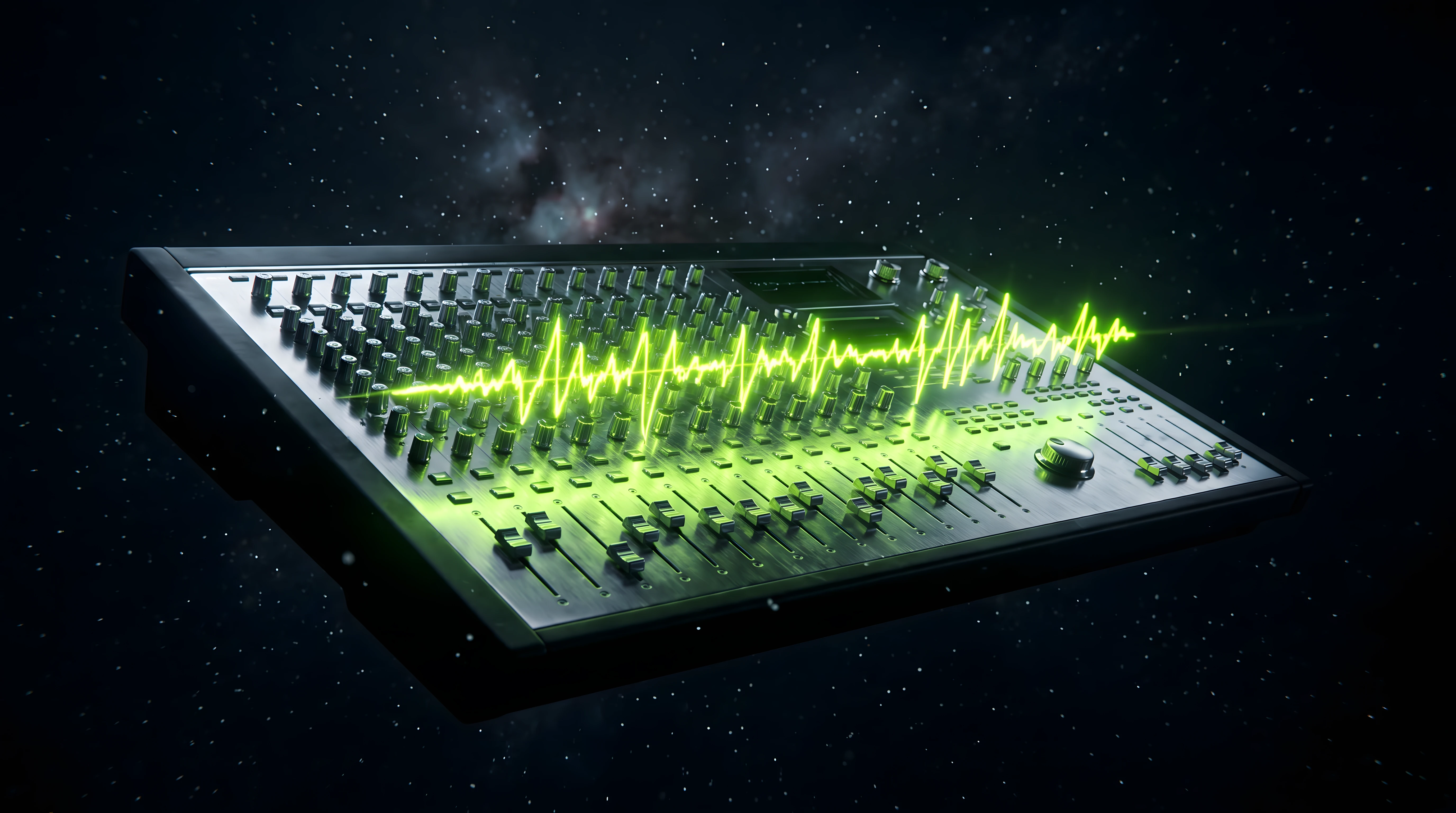
Netflix's sonic branding is defined by its iconic "ta-dum" sound logo. This short, percussive sound achieves maximum impact with minimal elements:
Brevity: Only about two seconds long — grabs attention instantly without overstaying its welcome.
Memorability: Despite its simplicity, the "ta-dum" is instantly recognizable globally.
Genre-Neutral: Crucially, the "ta-dum" doesn't predispose the viewer to any genre. It simply says "Entertainment is about to begin." See how the Ta-dum adapts across different content types.
Anticipation: Creates a Pavlovian response — the auditory equivalent of the curtains rising at a theater.
Netflix's sonic strategy extends beyond the "ta-dum" to UI sounds that enhance interaction without distraction, creating a seamless, modern digital experience.
Disney+: Heritage, Storytelling, and Nostalgia
Disney+'s sonic branding is a rich tapestry woven from decades of storytelling heritage:
Orchestral Richness: Disney+ leans into its legacy of grand, orchestral music that evokes the magic of classic productions.
Nostalgic Resonance: By using sounds that echo beloved Disney classics, Disney+ taps directly into the emotional memories of its audience.
Storytelling Emphasis: The sonic branding emphasizes the journey of storytelling itself.
Brand Extension: Disney+'s sonic strategy incorporates the identities of Marvel, Star Wars, Pixar, and National Geographic, creating a rich and varied sonic landscape.
Key Differences at a Glance
For a deep dive into how sonic cues guide navigation inside the Netflix app, see our dedicated breakdown.

Complexity: Netflix opts for simplicity; Disney+ embraces complexity and layering.
Emotional Tone: Netflix builds anticipation and modernity; Disney+ evokes nostalgia, wonder, and magic.
Musical Style: Netflix's sound is more electronic/percussive; Disney+'s is orchestral and melodic.
Audience Target: Netflix aims for broad demographic appeal; Disney+ targets families and fans with nostalgia-driven sounds.
TL;DR
Netflix and Disney+ represent two distinct schools of thought in sonic branding. Netflix's "ta-dum" strategy is a lesson in the power of minimalism. Disney+'s approach is a celebration of its rich heritage, using complex, orchestral sounds to evoke nostalgia and the magic of storytelling.
For a full breakdown of how Netflix uses sound to shape user experience, see our dedicated article.
Frequently asked questions
What is Netflix's sound logo called?
It's the "ta-dum" — a roughly two-second, two-note percussive sound logo that plays when a title launches. Despite its brevity, it's one of the most recognised sonic logos in the world.
Why is the Netflix ta-dum so effective?
It's short, genre-neutral, and globally consistent. Two seconds is enough to trigger a Pavlovian "entertainment is starting" response without committing the viewer to any particular mood or genre.
How does Disney+ use sound differently from Netflix?
Disney+ leans on orchestral, nostalgic music drawn from its storytelling heritage and sub-brands (Marvel, Star Wars, Pixar). Where Netflix bets on minimalism, Disney+ bets on layered emotional richness.
What makes a good streaming sonic brand?
Consistency across every touchpoint, an instantly recognisable sound logo, and an emotional tone that matches the brand promise — minimal and modern for Netflix, warm and heritage-driven for Disney+.
Curious about what your specific brand could sound like? If you are ready to turn your visual identity into a complete sensory experience, now is the moment to start the conversation about your sonic branding system.