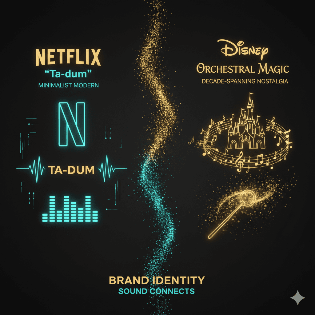
Netflix’s sonic branding is famous for one sound: the two-note “ta-dum” that Netflix calls Tudum. What gets discussed less often is how little else there is. Open the Netflix app and browse: rows, menus and search make no sound. The brand speaks once, at the moment that matters, and the interface stays out of the way.
The ta-dum: one sound at the moment of truth

Netflix introduced its sound logo in 2015; it was created by sound designer Lon Bender. It plays with the animated Netflix logo before a title starts and lasts about two seconds. Its placement is what makes it work: it sits exactly between choosing and watching, so it becomes the signal that the decision is over and the story is about to begin. Heard often enough, that cue is learned, much like a theatre going dark before the curtain rises.
A silent interface
Netflix does not use sound to guide navigation. When we checked the app in France in October 2026, scrolling through rows, opening a title and searching produced no interface sounds. To our knowledge Netflix has not explained this choice publicly, but it holds up:
Content already fills the room. Previews play their own audio while you browse; interface sounds would compete with it.
Devices already give feedback. A TV remote clicks and phones vibrate. Sound on top of that would be redundant.
One sound stays rare. With no lesser sounds around it, the ta-dum keeps all its weight.
Where sound does shape browsing

Outside the sound logo, the audio people hear while browsing is the content itself: autoplay previews play a title’s own soundtrack and dialogue when it is highlighted. Netflix lets each profile switch these previews off, a reminder of how intrusive unexpected sound can feel in an interface.
What brands can take from it
Put the brand sound where attention already is. One meaningful moment beats a sound on every tap.
Treat silence as a design decision. An app does not need interface sounds to feel finished.
Make every added sound earn its place. If you do add UI sounds, reserve them for feedback people actually need, such as confirming an important action.
TL;DR
Inside its product, Netflix’s sonic branding rests on a single, consistent asset: the ta-dum. The interface itself is silent, which leaves the content, and the sound logo, all the room.
Want sound like this in your own product? See how to design a sound logo and our sonic branding process.
For a direct comparison with how Disney+ approaches the same challenges with a completely different sonic philosophy, see our Netflix vs Disney+ sonic branding breakdown.