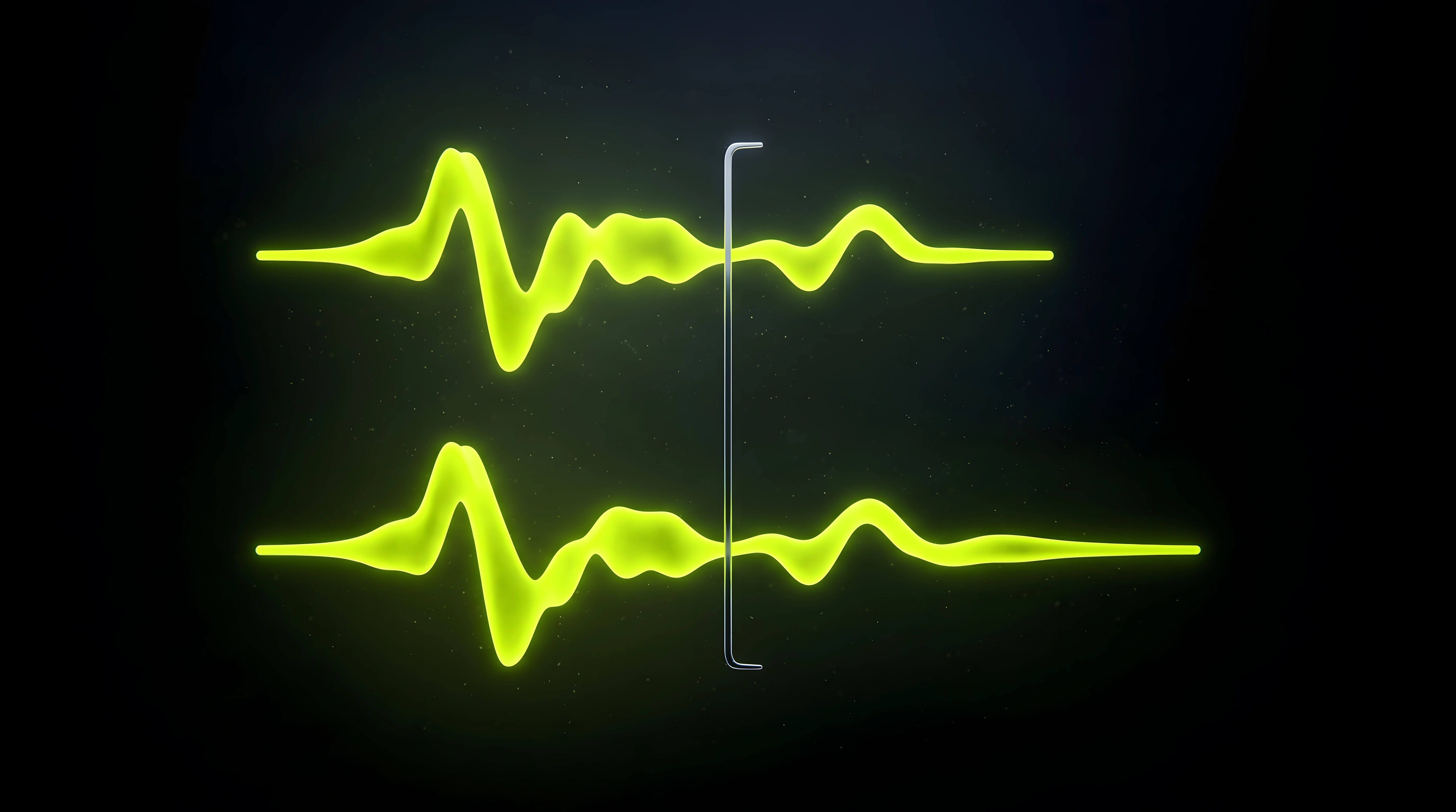
The full sonic logo works. Two seconds, a clean motif, a resolve that lands. Then the app team asks for something shorter for the checkout screen. The product team wants a single sound for notifications.
So someone trims the file. Fades it out after the third note. Ships it.
Nobody recognizes it. The short version sounds like a generic chime, because it is one: the part that carried the brand was the first thing cut.
Short versions are not trims. They are reductions, and they have to be designed. This note is how we cut a sonic logo down to a one-second version and a one-note tag that still read as the brand. It builds on how to design a sound logo. And if you read last week’s note on lock-screen audio controls, you already know these short files will never show up in a media notification: Chrome skips media shorter than five seconds, according to web.dev. They live inside the product, not around it.
How long should a sonic logo be?
There is no single number, and anyone who gives you one is describing their own system. What exists is a ladder. Each rung is shorter than the one above it and plays more often.
Full mark, about two to three seconds. Video intros, ad end-cards, event openers. Moments where attention is already committed.
Short version, around one second. App launch, checkout success, website micro-moments.
Tag, a single note or gesture. Notifications, confirmations, UI states that fire dozens of times a day.
Those durations are our working ranges, not an industry standard. For a reference point from interface design, Shopify’s Polaris guidelines capped short UI sounds at 250 milliseconds and long ones at one second (archived page, March 2025). A tag that lives inside a product has to respect a budget like that. A full mark does not.
The big sonic brands work the same way. When Mastercard launched its sonic brand in February 2019, its press release described one melody adapted into musical scores, sound logos, ringtones, hold music and point-of-sale acceptance sounds. One idea, many lengths. That is the system you are building.
The rule we use when we roll a sound logo out: the more often a touchpoint fires, the shorter the version it gets.
Find what actually carries recognition

Before you cut anything, you need to know what you cannot cut. A sonic logo has a handful of variables that carry identity: pitch contour, timbre, rhythm and the way it resolves. We broke those down in the anatomy of a sound logo. In most marks, only one or two of them do the heavy lifting.
Run a strip test. Duplicate the session and remove one layer at a time, rendering a version after each removal. Then play the renders to someone who knows the full logo and ask one question: is this still us?
The layer whose removal kills recognition is your core. Everything else is supporting cast. The results usually fall into three patterns.
Interval-led marks. Recognition lives in two or three notes and the jump between them. The short version keeps the interval and drops the rest.
Timbre-led marks. Recognition lives in one specific sound: a pluck, a synthetic bell, a processed voice. The short version keeps that sound and can lose most of the melody.
Rhythm-led marks. Recognition lives in the pattern. Keep the rhythm, even if it plays on a single pitch.
Write the result down. It becomes one line in the client’s variant map, and it stops the next person from trimming the wrong part.
Build the short version: compress, don’t crop
The instinct is to crop: keep the first second and fade the rest. That rarely works, because most full marks put their identity at the resolve, at the end.
Compress instead. Take the core you identified and rebuild it inside the shorter window.
Keep the contour, shorten the gaps. Tighten the space between notes before you remove any note. A three-note motif with shorter gaps still reads as the same motif.
Move the resolve forward. If the final note is what people remember, it has to arrive inside the window, not after it.
Thin the arrangement. Pads, reverb throws and secondary layers go first. A one-second sound cannot carry a room.
Shorten the tail on purpose. Do not chop it with a fade at the edge of the file. Shorten the decay inside the session, with a shorter release on the instrument or a shorter reverb, so the sound ends naturally.
Keep the key and the timbre. A short version in a different key or on a different instrument is a different logo.
Make one move at a time, exactly as in a revision round. If you tighten the gaps, swap the timbre and shorten the tail in one pass and recognition disappears, you will not know which move did it.
The tag: one note that still sounds like the brand
The tag is the hardest version to make, because it has almost nothing to work with. One note, or one short gesture, has no melody. What it can keep is the timbre and the final interval.
Two approaches work well.
The resolve note. The last note of the full mark, on the same instrument, with the same attack. People who know the logo hear it as the ending they expect.
The two-note fragment. The final interval, played fast. Just long enough to suggest the melody.
Whichever you choose, a tag has to survive repetition. Play it fifty times in a row. If it starts to grate by the twentieth, soften the attack or lower its level relative to the other versions. The tag is the sound a user will hear more than any other, and the one they will mute fastest.
Test recognition at every length

A short version is done when people who know the full logo recognize it, and people who do not still hear it as part of the same family. We test both, with the method from how to test a sound logo, scaled down.
Recognition. Play each version cold to five or six people who know the full mark. Ask them to name the brand. Fewer correct answers than for the full mark is expected. Almost none means the core did not survive.
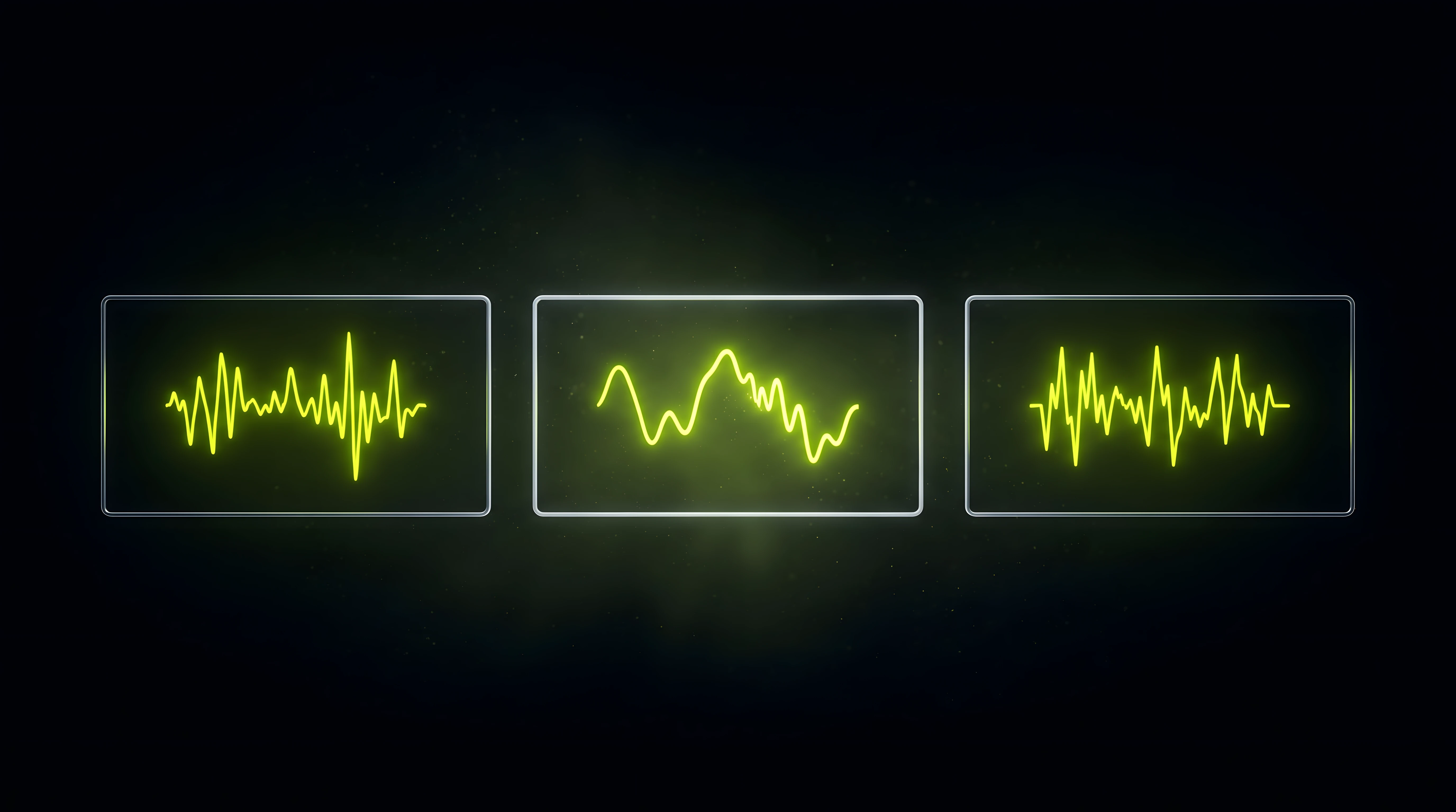
Family. Play the three versions in random order to people who do not know the brand. Ask which sounds belong together. All three should cluster.
Context. Play each version where it will live: on a phone speaker, under the animation, on the checkout screen. A tag that works on studio monitors can vanish on a laptop.
When a version fails, go back to the strip test, not to the EQ. A short version that fails recognition is almost always missing a piece of the core.
Render the family from one session
Keep all versions in one REAPER project, each on its own region named after its output file: brand-logo-full, brand-logo-short, brand-logo-tag. The three versions then share the same instruments, the same key and the same processing, and a change to the core sound reaches all of them.
We covered the render side in how to render web-ready audio from REAPER: regions, region wildcards in file names, normalization and trimmed silence. A logo family needs two extra rules.
Balance by ear, then lock it. A tag at the same loudness as the full mark tends to feel too loud, because it plays so much more often. Decide the relative levels, write them down, and render with fixed settings so they never drift.
Version the family together. If the core changes, all three files get a new version number. Mixing a v3 full mark with a v2 tag is how families quietly split.
Mistakes that break a short version
Cropping the start. The first second of the full mark is usually the setup, not the identity.
Changing the key to fit a UI. If the product team wants it brighter, adjust the timbre and the level instead. A transposed tag is a new sound.
Designing the tag first. Build the full mark, find its core, then reduce. A tag designed alone rarely grows into a convincing full logo.
Too many lengths. Three versions cover nearly every touchpoint. A fourth and a fifth usually mean a touchpoint needed a different level, not a different length.
Shipping without the map. If no document says which version goes where, someone will put the full mark on a notification within a month.
FAQ
How long should a sonic logo be?
In our work, the full mark runs about two to three seconds: long enough for a motif and a resolve. Most brands also need a short version around one second and a single-note tag. The right length depends on how often the touchpoint fires, not on a fixed rule.
Can I just trim the full sonic logo to make a short version?
Rarely. Trimming keeps the beginning, and most marks carry their identity at the end. Find the element that carries recognition, then rebuild it inside the shorter window.
Should every version have the same loudness?
No. They should feel balanced in use. A tag heard dozens of times a day usually sits lower than the full mark. Decide the relative levels once, document them, and render with fixed settings.
The takeaway
A sonic logo is not one file. It is a family, and the short members are where most of the listening happens. Find the core, compress it instead of cropping it, and test every length with people who know the original.
If you want a sound logo designed as a full family from day one, short version and tag included, start a project with us.