The site is done. It looks right, it loads fast, the client signed off. Turning it into a template feels like an afternoon of cleanup: swap the logo, write a listing, upload.
Then someone buys it. They replace your three portfolio items with eleven. They paste a headline twice as long as yours. They open the CMS and find a field called Text 4. They ask why the hero breaks on their iPad.
None of that is a bug in your site. Your site never had to survive a stranger.
That is the whole distinction, and it is worth stating plainly before anything else: a site is a result, a template is a set of decisions someone else has to be able to change. Everything below follows from it.
Your naming is the product
In a client project, layer names are private. Nobody but you will ever open the panel. In a template, the naming is the interface. It is the first thing a buyer reads and the only documentation they get while they work.
A buyer who opens your file and finds Frame 47, Group 12 copy and Desktop — final FINAL has already decided how much your template is worth. They will not say so in the review. They will just say it was confusing.
Rename before you do anything else, and rename with intent:
Sections say what they are for, not what they contain. Hero, Proof, Pricing, Contact. Not Section 1.
Components say what they do. Button / Primary, Card / Project, Nav / Mobile. The slash convention gives you free grouping in the insert menu.
Styles are named by role, not by value. Text / Body, Color / Surface. A buyer who changes the brand colour should not have to hunt for a style called Lime 500.
This takes an hour and it is the single highest-return hour in the whole build. It is also the cheapest way to fail review, because a reviewer opens the layer panel before they open anything else.
The CMS is where most templates break
A site with three case studies works fine with three collection items. A template gets bought by someone with one, or with forty.
Go through the collection field by field and ask a harder question than whether it renders. Ask what happens at zero, and what happens at forty.
Zero items. Does the section collapse cleanly, or do you get an empty grid with a stray divider floating in it? Framer will happily render nothing, which is usually worse than rendering a message.
One item. Does a three-column grid leave two ghost columns of dead space?
Forty items. Is there pagination, a load-more, or does the page become a mile long?
Field names matter as much as layer names. Title, Excerpt, Cover and Published are self-explanatory. Text 4 is a support ticket you have already written.
And populate the collection with content that looks like a buyer's, not yours. Three perfect items with images you shot yourself is a demo. Include an item with a long title, an item with no image and an item with a short body, because those are the three your buyer will actually have on day one.
Design for the content you did not write

Your copy fits because you wrote it to fit. That is the most common hidden assumption in a template, and it surfaces immediately after purchase.
Take every text layer that carries real weight and test it at three lengths: half of yours, exactly yours, and double yours. Headlines are the usual failure. A two-line hero that becomes four lines pushes the call to action below the fold on a laptop, and the buyer has no idea which of the twelve things they touched caused it.
Fix it in the layout rather than in the copy. Auto-layout with real constraints, minimum and maximum widths on text containers, and line-height that survives a wrap. If a section only works at one exact string length, it is not a template section yet.
The same applies to images. A buyer will upload a portrait photo into a slot you designed around a landscape crop. Decide what happens, set the fill behaviour deliberately, and check it.
Every state, not just the one in your screenshot
The screenshot state is the easy one. Ship the rest:
Hover and pressed on everything clickable, including cards, not just buttons.
Focus, visibly. Keyboard users exist and reviewers check.
Loading and empty for anything that fetches or maps over a collection.
Error, for any form.
404, styled, because the default is a flag.
None of these are exotic. They are simply the parts of a site that a client project lets you skip, because in a client project you control the content and can quietly avoid the edge.
The audio layer is the hard case

If your template carries sound, and ours do, this is where the most breakage hides. A visual component that misbehaves looks slightly off. An audio component that misbehaves plays a noise a buyer cannot explain or stop.
Three decisions have to be made by you, in the build, and not left to the buyer.
Where the audio unlocks. Browsers block playback until a real user gesture. A template that assumes autoplay works will be silent for every first-time visitor on the buyer's site, and the buyer will report it as broken. We covered the full constraint set in shipping a sound logo on the web.
What happens on navigation. If a visitor is listening and clicks through to another page, does the track cut out? Deciding that a player survives navigation is an architectural choice, not a setting, and it has to be made before the template is structured. We wrote up the approach in keeping audio playing while visitors move through a site.
What the buyer is allowed to swap. Expose the audio file as a property or a CMS field, not as something buried in a code component. If replacing your demo track means editing code, most buyers will ship with your demo track. We have seen it live.
Keep the files small and the format boring. One modern format with one broad fallback, per our codec guide. A template that bundles forty megabytes of uncompressed audio fails performance review on its own.
If you are building the component rather than buying it, the interactive audio component walkthrough covers the structure, and audio performance on a real site covers what it costs you.
Breakpoints are a content problem
Most template responsive bugs are not layout bugs. They are content bugs that only appear at a width you did not test with content you did not write.
Check every breakpoint with the doubled-headline version of the page, not the tidy one. Check the mobile navigation with nine links, not four. Check a card grid at the exact width where it drops from three columns to two, because that is where spacing tends to go wrong.
Then check it on a real phone. The device preview is a good approximation and it is not the thing buyers will use to judge you.
The setup guide is part of what you sell
A buyer's first twenty minutes decide whether they recommend your template or ask for a refund. Those twenty minutes are governed entirely by a document most sellers write last, in a hurry.
Keep it short and ordered by what they will do first:
What to replace, in order. Logo, colours, fonts, content.
Where the CMS lives and what each field is for.
Anything non-obvious. A code component that needs a key, an audio file that needs replacing, a form that needs connecting.
What is deliberately not editable, and why.
That last point saves more support time than the other three combined. Buyers do not get frustrated by constraints. They get frustrated by constraints they discover by accident.
Decide what you owe after the sale
A template is not a file you hand over. It is a small ongoing obligation, and it is worth drawing the line before the first message arrives rather than during it.
The line we hold is the same one we use for retained sonic branding work: you maintain the decisions you already made, you do not make new ones for free. Fixing a component that breaks in a new Framer release is maintenance. Adding a section the buyer wishes existed is a new project. We set that boundary out in full in what goes into a retainer and what stays billable, and it transfers to template support almost unchanged.
Write it into the listing in two sentences. It costs you nothing and it prevents the slow drift where a small sale turns into unpaid custom work.
The pass before you list
Run the template through this, in order, with fresh eyes or someone else's:
Open the layer panel. Can a stranger navigate it without asking you anything?
Empty the CMS. Does every section still hold?
Double every headline. Does anything push below the fold or overlap?
Tab through the whole page. Is focus always visible?
Load it on a mid-range phone on a slow connection. Does it stay usable?
If it carries audio: cold first visit, no autoplay, buyer's own file swapped in. Does it behave?
Hand the setup guide to someone who has never seen the file. Can they rebrand it in twenty minutes?
Anything that fails there will fail in review, or worse, after purchase, where it becomes a rating instead of a note.
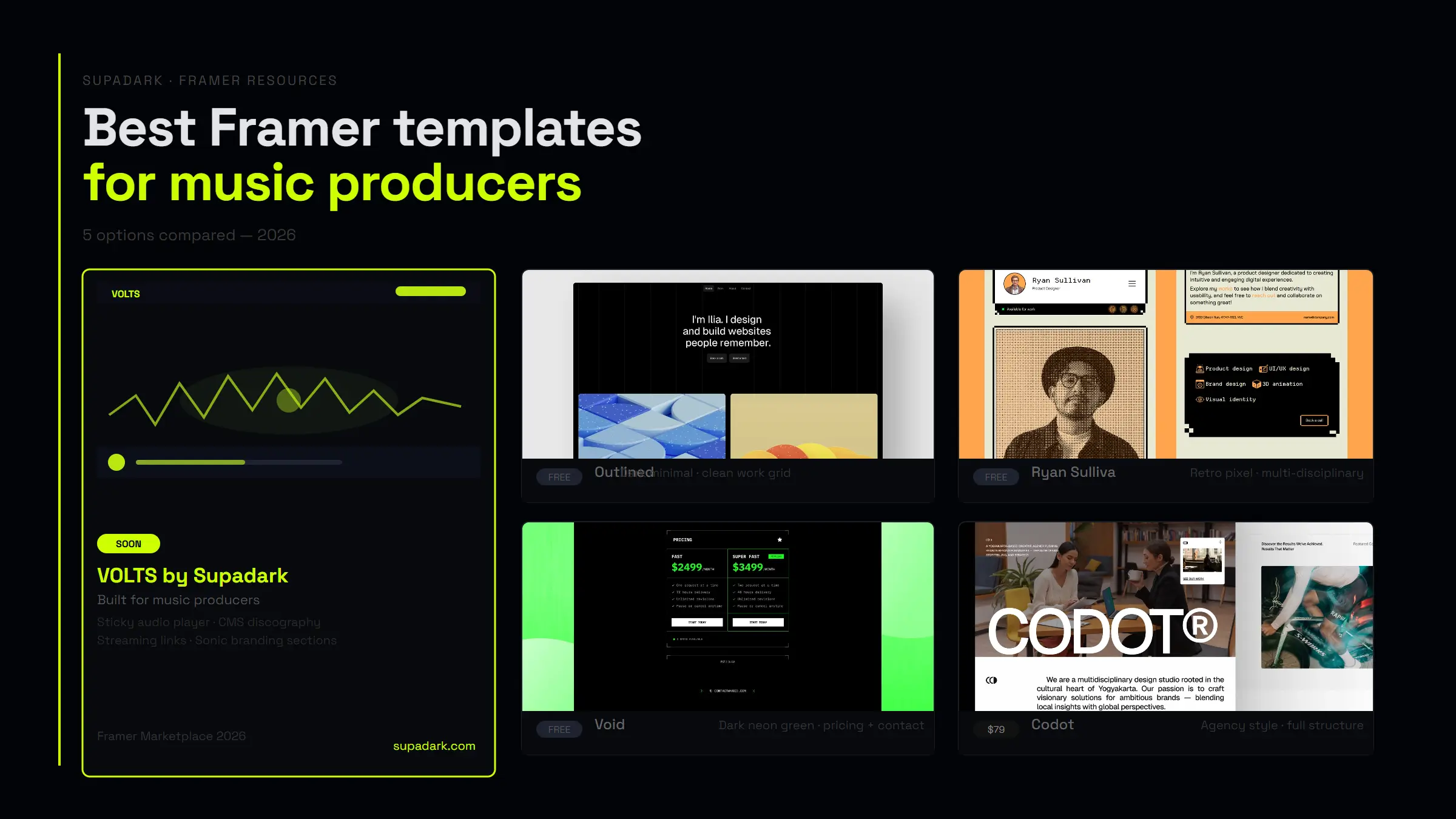
If you want to see how the finished result reads from the buyer's side, we keep a running comparison of the best Framer templates for music producers, judged on exactly these criteria.
The takeaway
The work that makes a site good and the work that makes a template sellable are different work. The first is about arriving at one result. The second is about handing someone else the controls and being confident about what they will do with them.
Name everything for a stranger. Build the CMS for zero items and forty. Design for copy you did not write. Ship every state. Make the audio layer swappable and quiet by default. Write the guide before you write the listing.
A template is finished when someone who has never met you can make it theirs in an afternoon, without messaging you once.