A music producer's portfolio site has roughly six seconds to prove the work is worth listening to. The visual gets you to the play button. The play button has to do the rest.
Most portfolios fail there. The audio is too hard to find, or it lives in a generic embed, or it stops the moment the visitor scrolls. The work is good. The presentation makes it sound like a hobby.
This article breaks down the five audio player patterns that actually convert music producer portfolios in 2026 — when to use each one, why they work, and what the implementation costs.
Why the Audio Player Is the Pitch
For a graphic designer, the portfolio image is the work. For a music producer, the audio player is the work. Everything else on the page — the typography, the case study copy, the bio — is scaffolding.
This changes the brief. The audio player is not a feature on the site. It is the surface where the producer's craft is judged. Every UX decision around it is a credibility signal: how fast it loads, how it handles cross-device playback, whether it survives a navigation, whether the waveform is the producer's actual track or a stock visualization.
A serious producer site treats the player the way a serious agency site treats the case study layout. With intent.
The 5 Patterns That Convert
1. The Inline Beat Preview
The smallest, fastest pattern: a play button next to a track title, sitting inline in a list. No waveform, no extras, no commitment.
Use this for catalog browsing — beat stores, sample packs, drum kits. The pattern works because it lowers the cost of sampling. A visitor can scan twenty tracks in a minute, hitting play and skip without any UI weight slowing them down.
The technical cost is low. A simple <audio> tag wrapped in a custom button works. For more reliable cross-browser behavior, Howler.js handles the playback layer with consistent results on Chrome, Safari, Firefox, and mobile.
The risk: this pattern only works if the catalog is the entire pitch. Drop it on a portfolio that's trying to sell custom production work and it underdelivers — there's no story, no context, no proof of process.
2. The Sticky Persistent Player
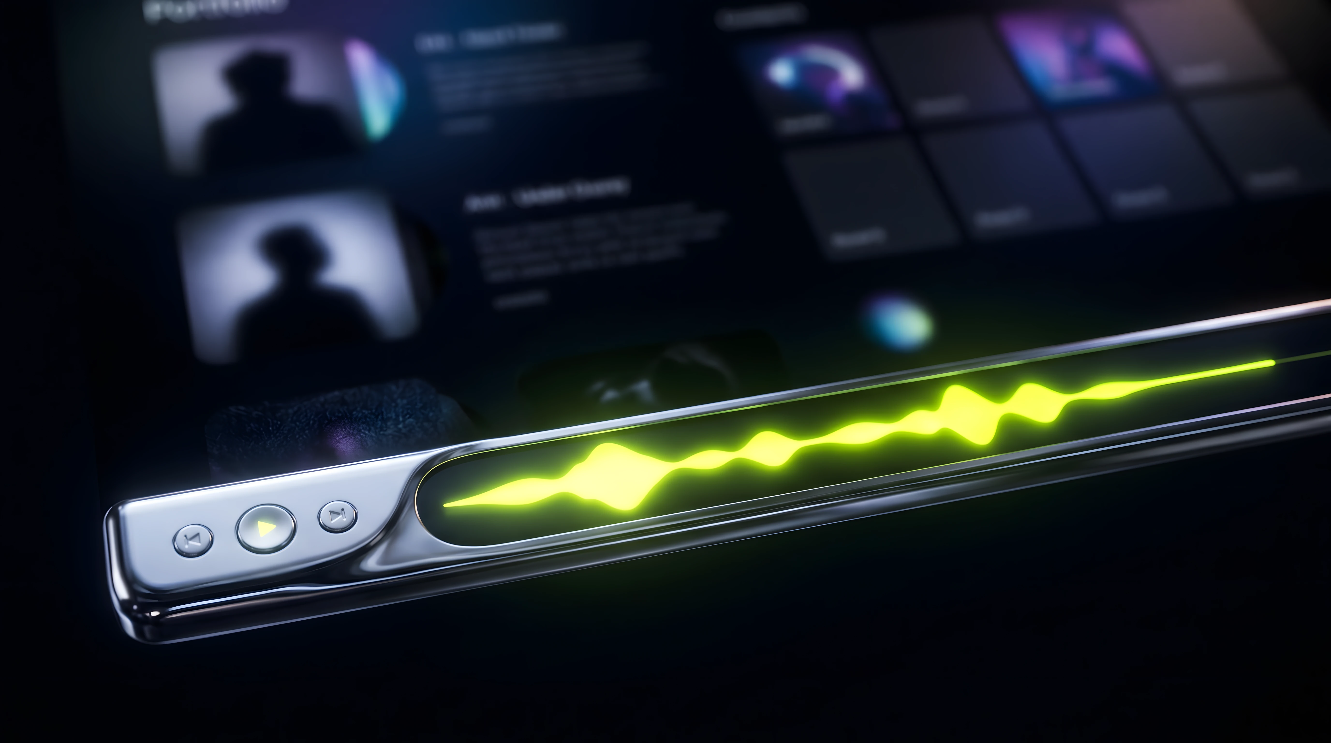
A player that anchors to the bottom (or top) of the viewport and keeps playing as the visitor scrolls through case studies, the bio, the contact page. Once a track is started, it survives navigation.
This is the highest-converting pattern for producer portfolios that double as creative agency sites. The visitor lands, hits play on the hero track, and continues exploring while the producer's sound builds the atmosphere for the rest of the visit.
Implementation in 2026 is much easier than it used to be. In Framer, a sticky audio player can be built as a custom code component that reads from the CMS and persists across page transitions when wired into the page transition system. The same architecture works in Next.js with a layout-level audio context.
The thing to get right: the player must remember its state across navigation. If a visitor clicks from the homepage to the bio page and the audio restarts from zero, the pattern fails.
3. The Visual Waveform Player
A player with a rendered waveform showing the actual shape of the track — peaks, drops, silence. The waveform doubles as a scrubber.
This pattern signals craft. A waveform that's the producer's actual audio waveform — not a generic illustration — tells the visitor that the site was built around the work, not around a template. The visual carries information: the visitor can see where the build is, where the drop is, where the silence sits.
For most use cases, Wavesurfer.js generates the waveform and handles the playhead. For producers who want full control over the rendering style — color, line thickness, scrubber animation — a custom canvas-based renderer driven by the Web Audio API is the next step up.
Use this on a small number of hero tracks, not on every track in a catalog. Rendering twenty waveforms hurts page weight and overwhelms the visitor. One waveform per case study is the sweet spot.
4. The Beat Catalog Grid
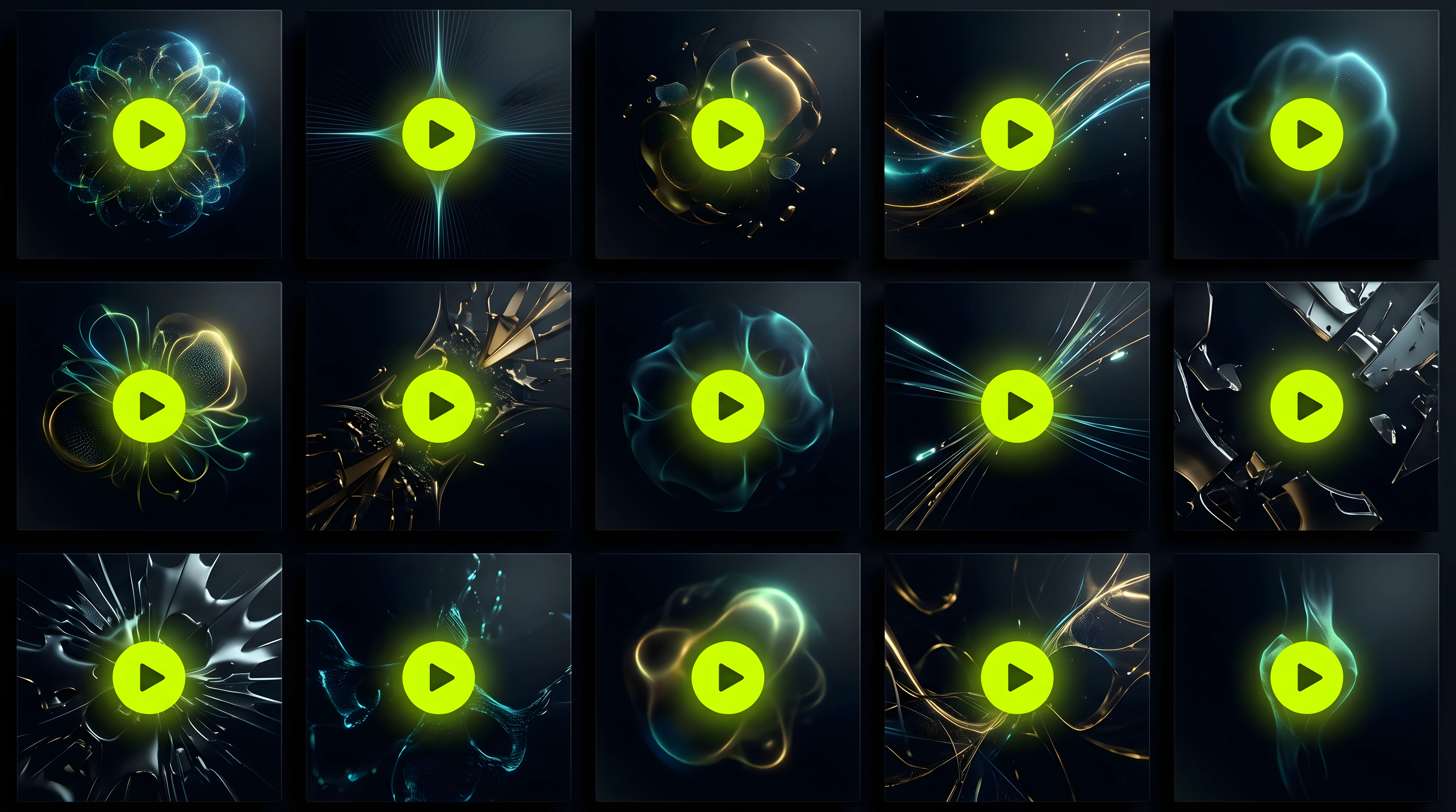
A grid of tracks with cover art, title, BPM, key, and an inline play button on each card. Filtering by genre, mood, or tag is part of the experience.
This pattern serves producers selling beats and sample packs as products. The grid is a storefront, and the play button is the try-before-buy. The visitor browses visually, hits play to confirm, and moves toward the buy button without leaving the page.
The technical pieces are straightforward — a CMS-driven grid is standard in Framer and Webflow, and the audio playback can be handled by a single shared audio engine that any card can trigger. The decision that matters is the layout density: too dense and the visitor doesn't focus on any individual track; too sparse and the catalog feels thin.
A grid that converts has clear hierarchy: cover art does the visual work, title and metadata sit in restrained typography, the play button is the only color-loud element on each card. The visitor's eye moves from cover, to play, to next.
5. The Streaming-Integrated Player
Spotify, Apple Music, SoundCloud, or Bandcamp embedded directly into the portfolio.
This is the right pattern when the producer's commercial center of gravity already lives on a streaming platform. A trap producer with a hundred thousand monthly listeners on Spotify has already earned credibility there — the embed brings that credibility into the portfolio without trying to recreate it.
The cost: streaming embeds are slow, branded by the platform, and they break the visual coherence of the site. They also pull the visitor's attention off the portfolio (the click that opens Spotify in a new tab is not a click coming back).
The right move is selective use. Embed Spotify on a single track at the bottom of a case study as proof of streaming traction. Don't build the entire site around platform embeds — at that point, the platform is the portfolio.
Choosing the Right Pattern (or Combination)
Most producer portfolios benefit from combining two or three patterns rather than picking just one.
Producer profile | Best combination |
|---|---|
Beats and sample pack seller | Beat catalog grid + inline beat preview |
Custom production agency | Sticky persistent player + visual waveform per case study |
Hybrid (catalog + custom) | Sticky persistent player + beat catalog grid |
Streaming-first artist | Sticky persistent player + selective streaming embed |
Sound designer for brands | Visual waveform player + selective streaming embed |
The wrong move is to ship every pattern at once. Audio UI competes with itself. A site with five different player styles tells the visitor that the producer isn't sure what they're selling.
The Tech Stack Question
The choice of platform shapes which patterns are practical to ship.
Framer. The strongest fit for producer portfolios in 2026. Custom code components let the sticky player and the waveform player be built natively and styled to match the brand. CMS-driven catalogs are first-class. The animation engine handles the page transitions cleanly, which matters for the persistent player pattern. The right Framer templates for music producers exist, but most still treat audio as an embed afterthought.
Webflow. Solid for the catalog grid pattern, weaker for sticky players (page transitions break audio context easily). Audio embeds are second-class citizens.
Next.js or custom React. Maximum control, maximum cost. Worth it only when the producer is also a developer or has one on retainer. The audio architecture can be exactly right, but the time-to-ship is measured in weeks, not days.
WordPress with audio plugins. Functional but immediately legible as a generic setup. The mismatch between an audio plugin and a producer's positioning is visible in the way the player renders.
For the libraries powering the audio layer: Howler.js handles file playback reliably across browsers, and Tone.js is overkill for a portfolio (it's built for synthesis, not playback). For waveform rendering, Wavesurfer.js or a custom canvas implementation. For interactive flourishes — a hover that previews a snippet, a beat-synced animation — the Web Audio API supports it directly.
The Mistakes Worth Avoiding
A few decisions that quietly cost producers traction:
Autoplay on landing. Browsers block it, and visitors who hear unsolicited audio leave faster than visitors who clicked play themselves. Trust the visitor to start the track.
No volume control. Audio without a volume slider gets muted by default. A muted visitor isn't hearing the work.
Stock waveforms. A waveform image that doesn't match the actual audio is worse than no waveform at all. Visitors who notice (and producers do notice) lose trust immediately.
Heavy preload on every track. Loading a 5MB audio file for every catalog item turns the portfolio into a bandwidth hostage situation. Stream the audio, don't preload it.
The single-track demo trap. A portfolio with only one playable track signals that the rest of the work doesn't hold up. A serious producer site shows range.
For a deeper breakdown of the patterns to avoid in interactive web audio, we covered the seven most common mistakes here.
Quick Self-Audit
Run through this checklist on a current producer portfolio:
Can a visitor start audio in under three seconds from landing?
Does playback continue across page navigation?
Are the waveforms the actual track, not generic illustrations?
Does the catalog (if there is one) load fast and stay scannable?
Does the player visually match the rest of the brand, not the platform default?
Is volume control accessible without hunting?
Does every track on the site have a clear next action — buy, contact, listen on streaming?
If three or more are unchecked, the player is leaking conversions.
Where This Fits in 2026
The bar for producer portfolios is rising. Two years ago, a SoundCloud embed and a contact form was enough. In 2026, with streaming saturation pushing more producers to differentiate at the brand level, the portfolio site is increasingly where the deal closes.
The audio player is the single most leveraged decision on that site. Get it right and the rest of the design has space to breathe. Get it wrong and no amount of beautiful typography saves the visit.
At Supadark, we build templates and components for producers who treat their audio as a product, not as an attachment to one. If you're rebuilding a portfolio in Framer this year and the player is the question you're stuck on, the interactive audio component guide is a starting point — and we're building the next generation of producer-first templates around exactly these patterns.
Frequently asked questions
What's the best audio player for a music producer portfolio?
It depends on the goal. A sticky persistent player suits custom-production agencies; a beat catalog grid suits producers selling beats. Most portfolios convert best by combining two patterns rather than picking one.
Should a music producer portfolio autoplay music?
No. Browsers block autoplay with sound, and visitors who hear unsolicited audio leave faster. Let the visitor press play themselves — a clear, fast play button beats forced playback every time.
How do I keep music playing while visitors browse my portfolio?
Use a sticky persistent player that anchors to the viewport and survives page navigation. In Framer, build it as a CMS-driven code component wired into the page-transition system so playback state persists across pages.
Is Framer or Webflow better for a producer portfolio?
Framer is the stronger fit in 2026: custom code components, first-class CMS catalogs, and clean page transitions for the persistent player. Webflow handles catalog grids but breaks audio context on navigation.
Should I embed Spotify on my portfolio?
Selectively. A single embed at the bottom of a case study proves streaming traction, but building the whole site around platform embeds makes the platform — not your portfolio — the destination.