
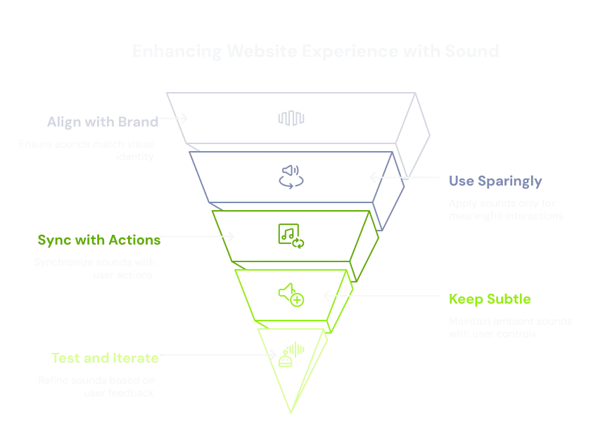
Quick answer: good web sound effects follow five rules — match the visual brand, use sound sparingly, sync it to user actions, keep ambient audio subtle with user control, and test with real users. Get those right and sound elevates the experience; get them wrong and it's the fastest way to make a visitor mute the tab.
Web sound, when used correctly, can elevate the user experience by providing feedback, reinforcing brand identity, and adding a layer of polish. However, it's a delicate balance, as poorly implemented sound can quickly become annoying and detrimental.

To use sound not as a gimmick, but as a functional and aesthetic tool to improve how users interact with and perceive a website:💡
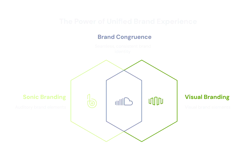
Match Sounds with Visual Brand
Core Idea:
Sonic branding should be congruent with visual branding. The sounds a user hears should feel like they "belong" to the website's overall look, feel, and message.
Why it's important:
Cohesion: Creates a unified and professional brand experience. Discrepancies can be jarring and make the site feel amateurish.
Reinforcement: The right sounds can subtly reinforce the brand's personality (e.g., playful, sophisticated, futuristic, natural).
Emotional Connection: Sound evokes emotion. Aligning this with the intended emotional response of the brand enhances connection.
Elaboration & Examples:
Minimalist/Modern: Crisp, clean, short digital "blips," soft synthesized "swishes," or subtle resonant tones. Think Apple's interface sounds.
Playful/Kid-Friendly: Bouncier, more melodic, perhaps slightly whimsical sounds. Maybe a soft "boing" or a gentle "sparkle."
Luxury/High-End: Understated, smooth, perhaps a rich but quiet "click" or a very subtle, elegant "chime."
Tech/Gaming: More synthesized, "sci-fi" effects, or short, impactful sounds for achievements/notifications.
Earthy/Natural: Organic-sounding effects like a soft "leaf rustle" or a gentle "water drop," if it fits the theme.
For the strategic foundation behind this congruence, see the 4 fundamentals of sonic branding.
Use Sound Sparingly
Core Idea:
Less is almost always more with web sound. The goal is enhancement, not auditory assault.

Why it's important:
Avoid Annoyance: Constant or unnecessary sounds are a primary reason users mute tabs or leave sites.
Prevent Distraction: Sounds should support the user's task, not pull their attention away.
Maintain Focus: Each sound should have a clear purpose. If a sound doesn't add value, it's likely subtracting from the experience.
Accessibility: Overuse can be problematic for users with sensory processing sensitivities or those using screen readers.
Elaboration & Examples:
What to add sound to: Key interactions like form submission success/error, critical notifications, opening/closing important modals, or a subtle sound when adding an item to a cart.
What to avoid: Sounds on every hover, every scroll, every minor UI element click, or background music that loops incessantly without user control.
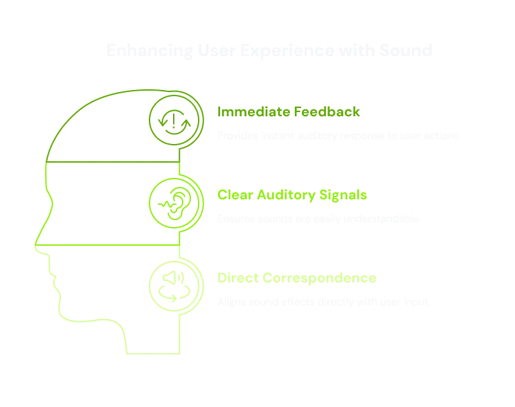
Sync Sound with User Actions
Core Idea:
Sound effects should provide immediate and clear auditory feedback directly corresponding to a user's input.
Why it's important:
Confirmation: Lets the user know their action was registered. Especially useful on touch interfaces or where visual feedback is subtle.
Responsiveness: Makes the interface feel more "alive," akin to pressing a physical button.
Reduced Uncertainty: Users don't have to wonder if their click "went through."
Elaboration & Examples:
Clicks: A subtle "tap" or "pop."
Toggles/Switches: A sound indicating "on" vs. "off" state change.
Form Submission: A positive "chime" for success, a muted "thud" for an error (with visual messages).
Drag and Drop: A sound for "picking up" and "dropping" an item.
Considerations:
Latency is the enemy. The sound must play immediately. Any delay breaks the sense of direct feedback — which is why the playback layer matters; see how to optimize web audio performance for low-latency delivery.
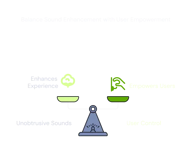
Keep Sound Subtle and Ambient (and Provide Control)
Core Idea:
If using background or ambient sounds, they must be unobtrusive and complement the experience, not dominate it. Crucially, users must have control.
Why it's important:
Ambience: Well-chosen ambient sound can set a mood (e.g., nature sounds on a travel site).
User Autonomy: Autoplaying sound is a major UX faux pas. Users might be in a quiet environment or already listening to audio.
Accessibility: Users with sensitivities might be overwhelmed; screen-reader users don't want competing audio.
Control (Crucial):
Clear Mute Button: Easily discoverable on every page where sound might play.
Volume Control: Allows users to adjust the sound.
Opt-In by Default: Ambient sounds should be off by default.
Remember Preference: If a user mutes the sound, remember it for the session.
Test and Iterate
Core Idea:
Sound design for the web isn't a "set it and forget it" task. It requires ongoing evaluation based on real user experience.

Why it's important:
Subjectivity: What sounds good to the design team might be annoying for actual users.
Contextual Differences: Sounds are perceived differently across devices, browsers, and operating systems.
Performance Issues: Sound files can impact loading times; ensure they are optimized.
Elaboration & Examples:
User Testing: Observe whether users notice sounds positively or reach for the mute button.
A/B Testing: Test sound vs. no sound for key interactions.
Analytics: Track how often mute buttons are used. A high mute rate is a strong signal.
The 30-second decision tree: should this interaction make a sound?
Is it a key action (submit, confirm, error, add-to-cart)? → A subtle sound is justified.
Does it happen constantly (hover, scroll, minor click)? → No sound — it will annoy.
Will it fire while other audio is playing? → No sound, or respect the user's mute state.
Does the sound match the brand's visual tone? → If not, redesign it before shipping.
Is there a visible mute/volume control on the page? → If not, add one first.
What's changed for 2026
Browser autoplay policies are now strict across the board — Chrome, Safari, and Firefox all block audio until the user interacts with the page. That has quietly enforced best practice: you can no longer ship autoplaying sound even if you wanted to. The 2026 move is to treat the first user gesture (a click on a clearly labelled sound toggle) as the moment audio switches on, and to store that preference. Designed-in, opt-in, remembered — that's the standard now.
TL ; DR
By thoughtfully selecting sounds that align with the visual brand's identity and tone, using them sparingly only for meaningful interactions, perfectly synchronizing them with user actions, and ensuring any ambient sounds are subtle and always accompanied by clear user controls, designers can genuinely elevate the website experience.
More, by rigorously testing and iterating on these sounds with real users, they ensure they are effective and not annoying. Neglecting these principles often leads to frustration and a perception of poor quality.
Frequently asked questions
Should websites have sound effects?
Only when they add meaning. Use sound for key interactions — form success/error, important notifications, add-to-cart — and avoid it on every hover or scroll. Sound should confirm or guide, never decorate.
Why is autoplay audio bad for UX?
Visitors may be in a quiet space or already listening to something. Forcing sound is intrusive and is the top reason people mute tabs or leave. Make audio opt-in and always provide a visible mute control.
How loud should web sound effects be?
Subtle. UI sounds should sit beneath the content, never startle, and always be adjustable. If a sound makes a user reach for the mute button, it's too loud or too frequent.
Which interactions should have sound?
Form submission (success/error), toggles and switches, drag-and-drop, critical notifications, and add-to-cart. Skip hovers, scrolls, and minor clicks.
How do I keep sound effects on-brand?
Match the sonic palette to the visual identity — crisp digital blips for modern, warm tones for luxury, playful bounces for kids' brands. Congruence between what users see and hear is what makes a site feel designed.
Go further
Curious about what your specific brand could sound like? If you are ready to turn your visual identity into a complete sensory experience, now is the moment to start the conversation about your sonic branding system.


